Watchmen (2019), Episode 7.
DB here:
If we want to understand the craft of filmmaking, we should pay attention to what filmmakers say about their technique. Sometimes we have to confirm what they tell us with other evidence and the onscreen results, but practitioners usually offer unique angles on their creative choices. For this reason I found it fascinating to come upon what Director of Photography Gregory Middleton had to say about his work on HBO’s limited-series Watchmen.
I had read the comic back in the 1980s and was intrigued by its experiments in pictorial storytelling. I’d also seen the movie, which I thought not as adventurous as the book and vitiated by the book’s adolescent nihilism. (Your mileage may vary.) But Middleton’s interview made me watch the series. So I thought I’d use this anxious pause in normal activities to share some ideas with you.
Middleton has a lot to say about the visual design, such as the sort of lenses he used to get startling depth effects. These echo some common graphic-novel compositions.
But I got more interested in other questions. How does the show adapt some classical cutting techniques? And how do those techniques square with the “editing” techniques we get in the original comic?
Here’s the relevant passage:
And transitions are the biggest tell when you cut from a beat of one thing to a beat of something else. In the case of the comics, one of the transitional devices we wanted to use to echo the graphic novel is the match cut. In the comic you’ve got one panel with a character in the foreground and someone in the background. The next panel is the same character in the foreground, but they are somewhere else — or somewhere else in a different outfit. And the background is something similar, but it’s something else, and you’re basically just jumping time because you’re really with the character and where their state of mind is, so the intervening time between how they went from here to there is irrelevant.
There is a great one in episode two where Angela walks back after they just sat down, and she sort of disagrees with the idea of going to rustle up the people at Nixonville, and she walks away, and she’s pacing as a match cut to her pacing at the police lineup at Nixonville. You go right where she’s thinking, like Okay, I don’t want to be here, but now I’m gonna be here, and suddenly you’re right there.
The match cut is also a way to instantly transport the audience without introducing a lot of other extraneous visual information. In episode four, we did her opening and closing her trunk when she is going to just get rid of the wheelchair she’s cut apart. She chucks it in the trunk, slams the trunk, and it’s a match cut to her opening the trunk, and she’s already somewhere else. And that just works — you don’t need to see her driving and parking and all that. The point is you just know she is dumping this thing, and it’s a nice, clever way to keep you on point with where she is with her intent.
Afterward, it’s like he’s just jumped ahead again — both places, same time. So it’s a way to sort of double-use that technique. It just takes a lot of planning and preparation. Nicole [Kassell, director/producer] and I worked hard on all the transitions in that episode to try and achieve that effect and make it interesting.
The transitions between scenes that Middleton is discussing are, I think, what have been since the 1940s called “hooks.” His comments open up some ideas about how editing works with them.
There are some spoilers, but not my usual quota.
Matchmaking
We can enhance our understanding of filmmakers’ creative options if we systematize a little bit the choices they face and the terms they use. That’s what I try to do in the online essay on hooks between scenes. There I suggest that we can have four sorts of palpable hooks from shot to shot: sound/sound, sound/image, image/sound, image/image. My examples come from National Treasure (2004), a movie that revels in tricky transitions.
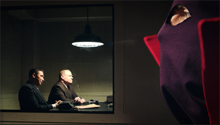
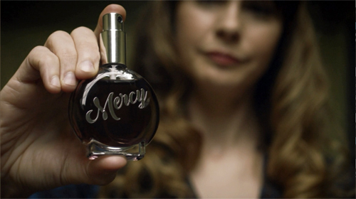
For example, one transition in Watchmen creates a sound/ image hook. The Game Warden tells Adrian, “No Mercy” and we cut to a close-up of a Mercy perfume being tested on a focus group.
Middleton calls the cuts that create image/ image hooks “matches.” “Match” is a broad term that points up a general principle of cutting for continuity. In a match shot-change, which might be a cut or a dissolve, something in shot B picks up something that was in shot A. Without distinguishing different types of matching, Middleton is stressing how continuity editing techniques, normally applied within scenes, can be used as transitions between scenes as well.
So let’s create an initial menu of possibilities. Within scenes, there’s the eyeline match, which shows a single character looking, followed by a shot of what the character sees (not necessarily from their optical viewpoint).
Shot/reverse exchanges like this one often rely on the eyeline match, but need not; you can have a shot/reverse pattern if the characters aren’t looking at each other. (Imagine two people talking with their backs to each other.) The eyeline match can link more than two characters within story space.
There’s also the match on action, where a bit of movement in A is carried over into B, despite the change of camera position. The scene between Wade and Angela continues with a combination of the eyeline match and the match on action.
Another sort of match plays upon the sheer pictorial qualities of the two shots. As Middleton says, shapes and color patches can be carried over from the background or foreground or both. Filmmakers don’t seem to have developed a specific term for this type of shot change, although they were clearly using it from at least the 1920s onward. (Eisenstein was the most explicit.) In Film Art: An Introduction, Kristin and I proposed calling the lining-up of compositional features from A to B a graphic match.
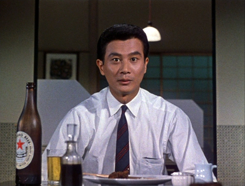
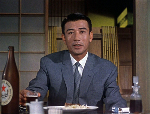
Precise graphic matches are common in experimental films, but they seldom show up within scenes of narrative films. Still, Eisenstein, Lang, Ozu (here, from An Autumn Afternoon), and a few other directors made bold use of them. And they’re obviously a matter of degree: Ozu can match an overall shot in some detail, as above, or just one portion of the frame.
We might add the possibility of the “category match,” as when a prop in shot A is followed by something comparable in shot B. Imagine cuts among wanted posters inside a sheriff’s office.
When we move beyond the individual scene, what are the possibilities? Clearly, all types of match-cutting can be used for transitions.
In Watchmen, an eyeline match shifts us from Angela, lying wounded on her living room floor, to a view of Judd looking down at her in the hospital when she awakens. Here the eyeline yields an optical POV.
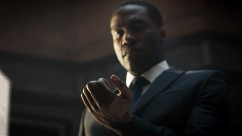
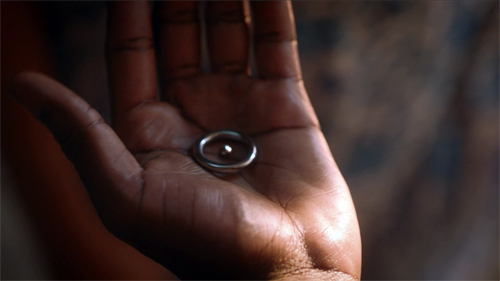
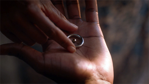
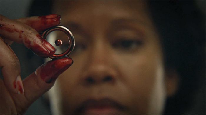
A match on action takes us from one scene of Cal opening his hand to another as Angela reaches for the hydrogen-atom ring.
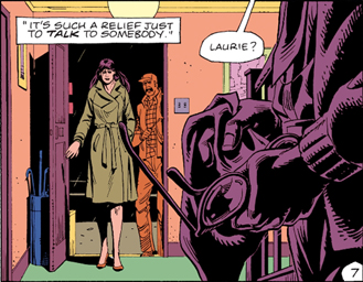
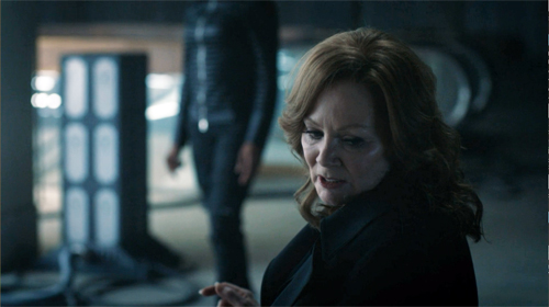
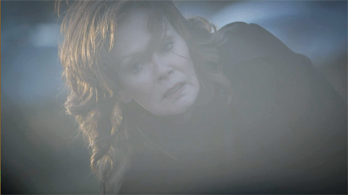
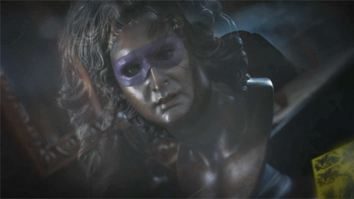
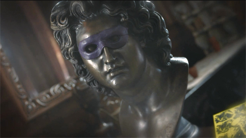
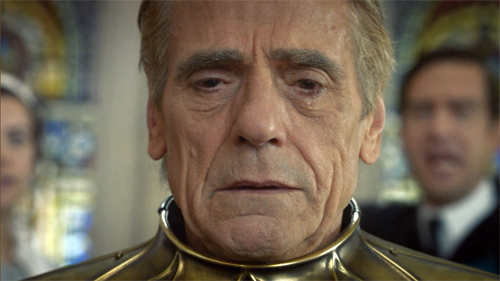
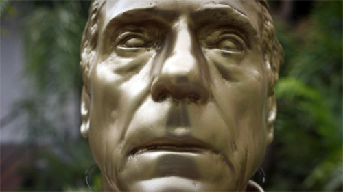
A hook can also exploit a graphic match. As Laurie lies sideways after a bomb blast, the image dissolves to a similar composition, a twisting view of a masked bust.
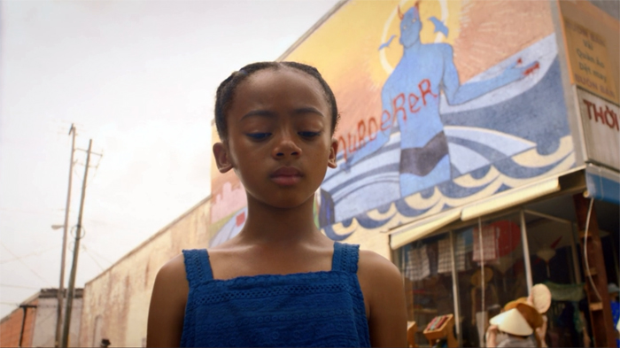
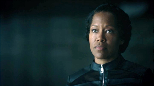
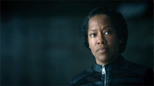
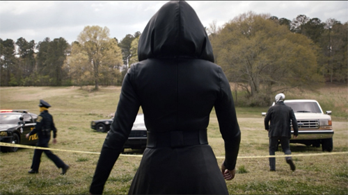
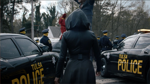
Middleton points to one striking moment that viewers are likely to notice: a match on action that’s also a bold graphic match. Angela strides away from one scene and continues her movement, and her compositional thrust, in a new location, Nixonville.
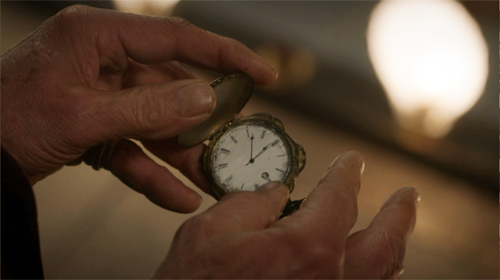
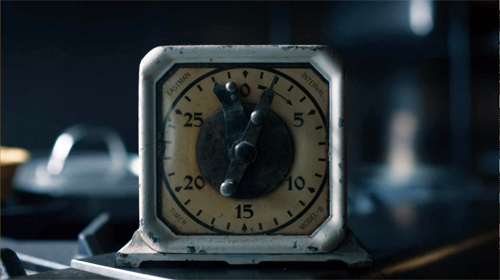
The “category match” is at work on occasion too, as when one scene ends on a pocket watch and the next starts on a clock face.
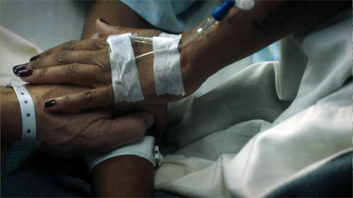
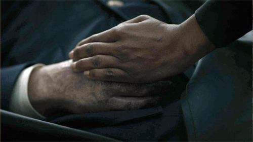
The category match blends with the graphic match when hands links scenes.
What seems to have sensitized the show’s creators to the possibilities of hooks is the fact that the Moore/Gibbons comic makes punchy use of graphic matches between panels. These are often used to signal character memories by opening and closing flashbacks.
Vivid as these examples and others are, the hook, even the graphically matched one, has a long lineage, as my essay tries to show. The creators of Watchmen are working in a distinct tradition of classic filmmaking.
Showing and showing off
More broadly, that classic tradition favors speed and quick pickup. The new Watchmen is essentially a police procedural, unlike the comic and the feature film. Accordingly, the investigation of a crime is interwoven with the personal lives of the police, the “cop soap opera” that brings in friends, family, lovers, and secrets from the investigators’ pasts.
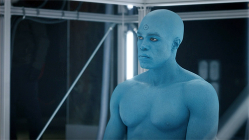
The crucial backstory involves Angela Abar, who knits together many threads. The child of a US black soldier and a Vietnamese woman, she became a policewoman in Tulsa and underwent the new militarization of the force in response to white supremacy. Some of the earlier Watchmen team, notably Adrian Veidt and Dr. Manhattan, are still exercising their power, while Laurie Blake, the daughter of Silk Spectre, is now working for the FBI.
Like the comic, the series must move the plot swiftly between past and present. The comic splinters time more audaciously, jumping back and forth across its grid of nine vertical panels. But in a classical film, where you don’t normally pause or go back, the story must unwind linearly, and so other strategies come forward to impose a felt pattern.
Older films might dwell on the aftermath of a scene, letting the tension relax a little, and provide a cadence that marks off a distinct section. Modern films, especially if they’re presented in the distracting environment of home viewing, display a need to maintain a rapid pace. So scenes push to a high point, then provide a “button” like that close-up of Laurie, and then move swiftly to the next. Among other advantages, this tactic keeps people from pausing or changing the input. Still, the scene shifts need to be clear fairly quickly.
Hooks can help on both fronts. They snap up the pace, keep us alert, maintain interest from moment to moment. A less clear-cut hook can provide a bump of surprise that teases us into the next scene. Soon, though, we will get imagery, and especially dialogue, that anchors us in the ongoing action.
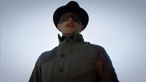
Hooks also provide motifs that can cascade through the film. Adrian’s ambitions to be the new Alexander the Great are provided by cuts that mock his pretentions.
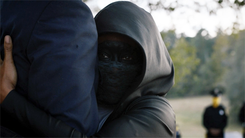
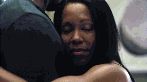
And, as in the comic, the cinematic hooks facilitate subjectivity. The most common way classical storytelling justifies unrealistic or nonlinear narration is through getting into characters’ heads. (Middleton: “You’re really with the character and where their state of mind is.”) Abrupt and startling cuts can be motivated if what we see is a memory, a dream, or a hallucination. This is what we get when Angela embraces Judd’s legs: a match-on-action hook to a flashback of her slow-dancing with Cal.
The most elaborate hooks can provide something more: a certain elation in virtuosity. The precise matching of Angela’s stride across those two scenes above is a stylistic flourish that asks us to appreciate the care and bravado of the filmmakers.
Hooks, however flamboyant, stand out against a pervasive backdrop of classically constructed scenes. We get lots of over-the-shoulder reverse angles, properly timed reaction shots, now-standard cuts to extreme distant shots that provide a “beat” for the scene, and other devices that have been around for decades. Plenty of other traditional strategies for narrative coherence are on display, from goal-oriented protagonists and deadlines to newspaper headlines and TV broadcasts as sources of impersonal narration. There’s even the inevitable Hollywood line: “What are you doing here?” As usual, striking moments emerge out of a familiar flow of narrative cause and effect, with some mysterious gaps eventually filled.
Paging the Watchmen
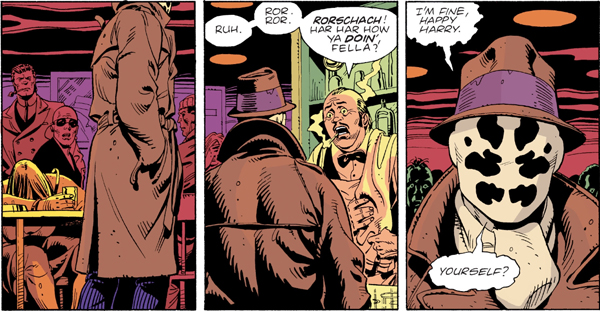
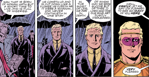
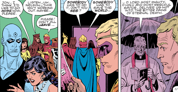
Comics artists absorbed the lessons of continuity filmmaking. If the hooks in films stand out by contrast with the overall smoothness and linearity of classic construction, something similar happens in comics. Here are three “continuity shots” from the Watchmen graphic novel, complete with obedience to the axis of action, reverse-angle cutting, and a “single” for emphasis on Rorschach’s reaction.
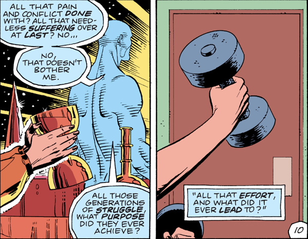
Even a match-on-action hook can be suggested, as when Laurie’s lifting a goblet on Mars “cuts” to her as a teenager lifting a dumbbell.
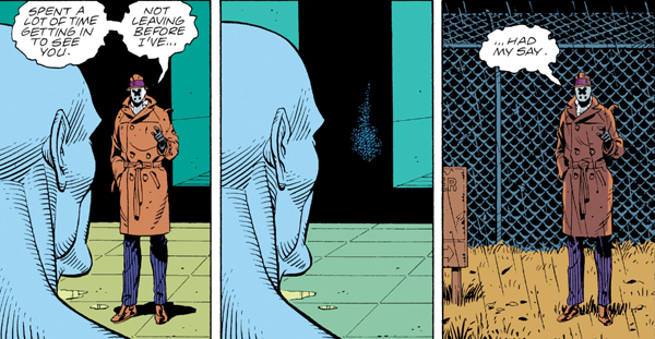
Graphic continuities and discontinuities can be motivated by science-fiction premises, as when Dr. Manhattan teleports Rorschach out of the facility. The sense of instantaneous change wouldn’t be so strong if Rorschach’s size and placement in the format weren’t kept constant.
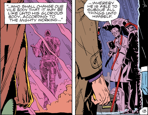
In a way, the graphic continuities are almost needed for the time-shifting transitions. A new angle on Adrian at the start of the funeral flashback below would be more confusing than the frontal close-up that completes a gradual enlargement of his face. The new costume and the “offscreen” dialogue cue us to a new scene.
To keep things tidy, the flashback ends with a foreground graphic match on Adrian, leading us back to the funeral.
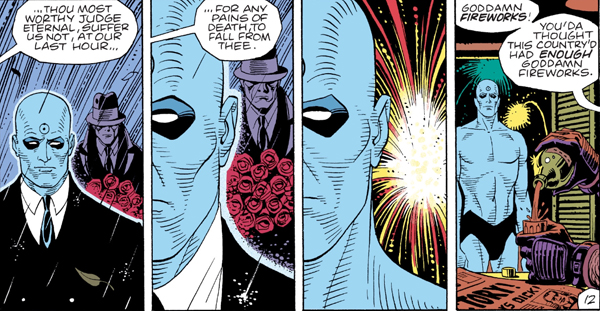
As ever, popular narrative maintains symmetry and redundancy to keep the action clear. Here’s a more “staggered” but no less symmetrical foreground graphic match–used, again, for subjectivity.
The rectilinear staging evokes either a track-in (the first two panels) and a track-back (the last two) or axial cuts in to and back from Dr. Manhattan. (The Soviets called these in-and-out edits “accordion” cuts.)
So there are some rough equivalents between film editing and the principles binding comic panels, especially ones this jammed with information. But comics have unique resources too–ones that Watchmen‘s creators were well aware of. Dave Gibbons notes that he exploited techniques articulated by the great Will Eisner, “where you could, say, hold the camera’s point of view and have characters walk past it, or follow the characters through a scene acrosss a changing background, where you could echo panel compositions . . . .”
The echoes Gibbons mentions depend on the fact that the book page and its role in a two-page spread create a force-field that displays the story both as a timeline and a spatial array. Panels are at once phases of action and a simultaneous order of images, and the interplay of story information and pictorial pattern can become quite rich, even baroque.
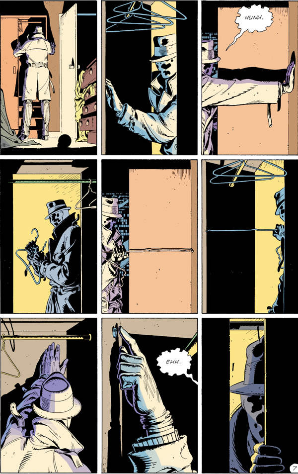
Consider when Rorschach rummages in the Comedian’s closet. Even if we could replicate the panels in a movie shot by shot, the page’s severe structure couldn’t be grasped as a simultaneous whole onscreen.
The echoes are striking. Panel 1, the establishing shot, is enlarged in panel 7 on the bottom row, as is panel 2 in panel 8. Each lower-tier mate is markedly closer than the top one, emphasizing the growing sense of discovery. Panel two, with its sidelong strips of solid black, is echoed in panel 4 and panel 6 (a slight “pan” left from 4) and, with another enlargement, in panel 9, the climax. The color slabs (yellow/black, grey/purple) accentuate the repetitions and variations. The middle stretch, panels 3-6, forms a suite of variations as well (5 picks up 3, 6 picks up 4), while Eisensteinian cuts flip us back and forth across the axis formed by the straightened coat hanger. All the cuts are compass-point shifts, moving us in 90-degree multiples. The crisp geometry of the découpage renders the unhurried professionalism of Rorschach’s search, an effect accentuated by the snapshot imagery (no motion lines).
The effect depends in large part on the presence of all these images on the page at once. The alternation of shot scale and color fields can only be discerned by seeing the overall architecture of the page.
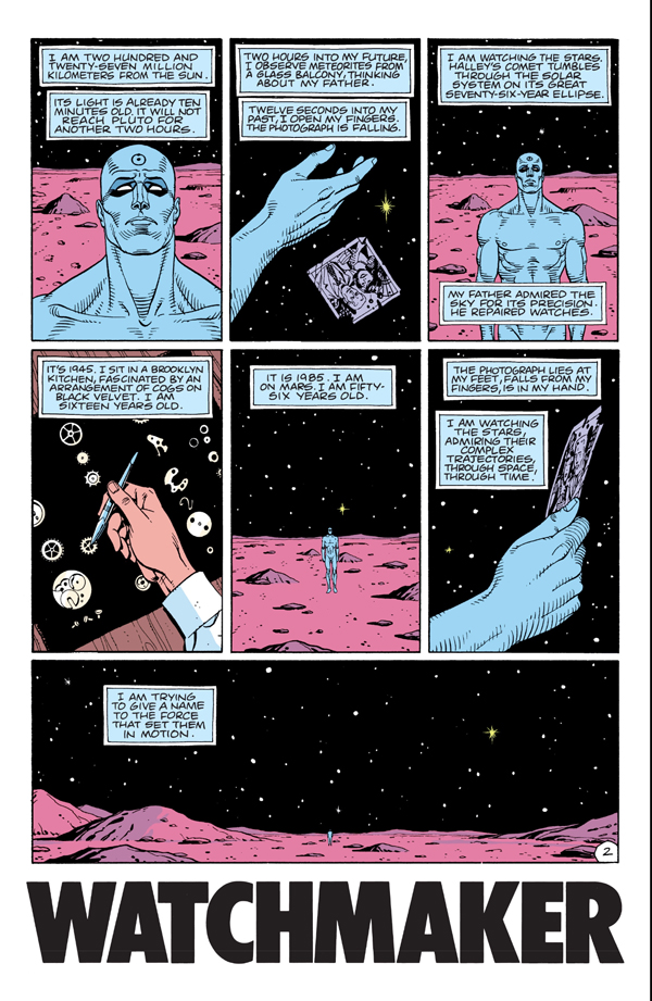
Panels 1, 3, and 5 build to the climax of the wide framing on the bottom as we pull farther back from Dr. Manhattan during his soliloquy. Panels 2 and 6, echoes of a close-up of the photograph, provide a sharp contrast to the landscape and emphasize the power of memory. That power is enacted in another variant of the hand image, as the young Jon Osterman arranges watch parts, like stars, on a velvet ground.
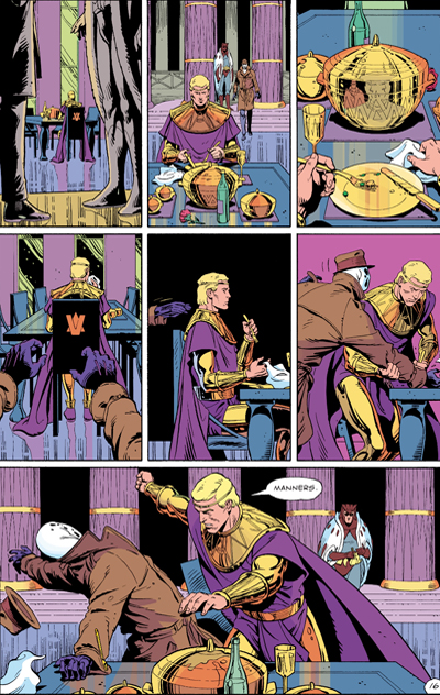
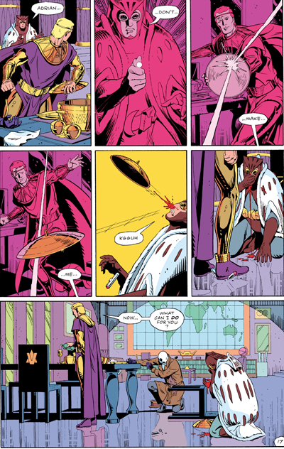
The page is one standard mid-size unit for the comics story, but the two-page spread is the next phase up. A continuous action can be spread across the open book, with echoes emerging. In the big fight scene, the shifting POV (occasionally objective, but also bouncing us among Rorschach, Adrian, and Daniel) is capped by symmetrical wide panels at the bottom of each page. The rose-tinted panels on the right page add their own fillip of pattern.
In a film such symmetries and variations unfolding over time, but we can make them apparent only through a “spatialized” analysis, spread out on the page like a comic-album layout. (Such were those pioneered by Raymond Bellour in the 1960s and 1970s.) In comics, these patterns strike us immediately, as a primary and palpable expressive vehicle. One-off devices like the graphic matches can be sustained both on the screen and on the page, but each medium stamps its own structures on the flow of time.
There’s a lot more chop and change in the space-time continuum of the Watchmen comic than I can do justice to here. (Some pages run three time periods simultaneously.) But my main point should be clear. As usual, when we start to pay attention to the films and media artifacts that fascinate us, we always find more going on than we realized. Both movies and comics work on us so directly that their design subtleties can easily pass unnoticed. We can keep reverse-engineering them as long as we like, and we’ll learn a lot.
I first became aware of Gregory Middleton’s comments by reading the review essay by Namwali Serpell, “In the Time of Monsters,” New York Review of Books (9 April 2020). I’m grateful to Serpell for calling my attention to the problem of cutting in the Watchmen series.
The essay is somewhat misleading in its account of match cutting, which is said to create “‘jumps’ rather than flows from shot to shot.” It’s actually just the opposite. The match cut creates continuity of time, space, and graphics between shots. It need not, as the essay claims, link two settings, and it’s not an alternative to a “splice cut,” which is a term with no currency I’m aware of. (A splice is simply the physical join between film strips, and it can govern any type of cut. Splices are increasingly rare with the dominance of digital editing.) The alternative to match cutting would be discontinuity cutting.
Serpell’s essay is worth reading for its interpretive dimension. She argues that for all the creators’ efforts to create strong images of minority heroes fighting white supremacy, there is a critical, antiheroic aspect to the original comic that isn’t picked up in the series. The sanctioned violence of Angela, Wade, and others is treated as unproblematically righteous.
I’d largely agree. Yet I’m not sure that the original book’s portrayal of superhero trauma (the result of the go-to source, childhood abuse) elevates these caped crusaders much. They seem to me best understood as part of that cycle of debunked superheroes we find in other 80s comics, notably The Dark Knight. Why would someone put on a mask to fight crime alone? What dignifies vigilantism? Are these “the heroes we need now”? These, we’re told, are deep questions, but they seem to me the tropes of a quickly standardized set of conventions. They signal a “new complexity” and “adult attitude” comparable to the romanticism of film noir and the cynicism about samurai ideals we find in Japanese swordplay movies. Bringing heroic genres low is itself a genre convention.
More broadly, I’d propose that the the storytelling strategy Serpell highlights is part of the common move within thematically ambitious mass-market movies to be strategically ambiguous. Creators, I’ve suggested here, often throw many things against the wall to see what will stick. They can then point to contradictory aspects which show balance. So yes, Angela tortures members of the Seventh Kavalry, but (a) they’d do the same to her; and (b) she’s driven by righteous vengeance for ancient wrongs; and (c) we want to make you a little uncomfortable with her vigilantism anyhow. Nowadays, it may be that what seem involuntary contradictions are deliberate efforts to have things many ways at once. This maximizes viewer outreach and gives critics fodder for debate. For another recent instance, see the previous entry on The Hunt.
The Dave Gibbons quotation comes from the supplement “The Phenomenon: The Comic That Changed Comics” available on the DVD of the Director’s Cut of Watchmen, 9:35-10:14.
Raymond Bellour’s “spatialized” analyses of repetition and variation can be found collected in The Analysis of Film (Indiana University Press, 2001). Some efforts of mine are in On the History of Film Style and in Ozu and the Poetics of Cinema (available for free, if patient download here), as well as in other material on this site.
Watchmen (2019).
0 comments:
Post a Comment