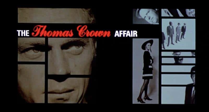
Welcome to The Queue — your daily distraction of curated video content sourced from across the web. Today, we’re watching a video essay on the movie title design and opening title sequences of Pablo Ferro.
An immigrant from Antilla, Cuba, the late Pablo Ferro (1935-2018) deserves to take up space in the brains of all self-respecting cinephiles. Self-taught and iconoclastic, Ferro freelanced his way to the big leagues, rubbing elbows with everyone from William Tytla to Stan Lee, ultimately forming his own company, Pablo Ferro Films, in 1964.
Ferro is best remembered for kicking down various doors in the realm of opening title sequences. His hand lettering for the mid-flight refueling titles of Stanley Kubrick’s Dr. Strangelove, a pointed repudiation of the geometric graphics of the Basses, Binders, and Brownjohns.

His revolutionary split-screen montage for 1968’s The Thomas Crown Affair brought an unprecedently fast and furious ad-like energy to the big screen. From Beetlejuice to Men in Black to Stop Making Sense, Pablo Ferro contributed his work to over one hundred iconic title sequences. Suffice to say: his is a name worth knowing.
The video essay below is a marvelous place to start, offering a quick primer on how Ferro shook up the cinematic world of graphic design, title sequences, and even editing. If it tickles your graphic design sensibility, we also recommend checking out Richard Goldgewicht’s excellent 2012 documentary Pablo.
Warning: the following video contains flashing imagery that may be triggering to readers with visual sensitivities.
Watch “The Art of Movie Title Design | Pablo Ferro and the Freeform Revolution”:
Who made this?
This video essay on the title design of Pablo Ferro comes courtesy of the fine folks at Little White Lies, a film-obsessed magazine based in the United Kingdom. Luís Azevedo edited the video. You can follow Little White Lies on Twitter here. And you can check out their official website here. You can subscribe to their YouTube account here.
More videos like this
- This is the second part in a series about the titans of movie title design. Here’s part one, also edited by Azevedo, on the titan himself: Saul Bass.
- And speaking of Bass here’s a trailer by The Criterion Channel promoting their “Saul Bass Turns 100” collection.
- For another taste of Little White Lies, here’s a video that eulogizes the dramatic power of the movie phone booth.
- While we’re watching Little White Lies videos, here is a New Year’s Eve supercut to close off last year.
- Finally, here’s is their beginner’s guide to the films of Oscar-winning Nomadland director Chloé Zhao.
0 comments:
Post a Comment