The name’s Bond. Bondathon. With 24 official James Bond films to conquer before No Time To Die hits theaters (someday!), Bond fan Anna Swanson and Bond newbie Meg Shields are diving deep on 007. With shaken martinis and beluga caviar in hand, the Double Take duo is making their way through the Bond corpus by era, so hang up your hats and pay attention. This time, they’ve set their scopes on ranking the James Bond opening title sequences.
What do all the James Bond films have in common? There are the obvious motifs: gadgets, girls, guns, and of course, the man himself. But aside from these qualities — which all exist in Ian Fleming’s source material — there’s one uniquely cinematic aspect that prevails in all twenty-four films: the opening title sequence. For nearly six decades, these flashy montages have set the stage, introducing us to the film about to unfold. Some of them have complimented the best films in the franchise, others have been the best thing about the more lackluster entries. But, whether they’re masterpieces or For Your Eyes Only, every opening title sequence is integral to what makes a Bond film a Bond film.
Despite the films ranging across almost sixty years, there have only been a small handful of title designers. The most prolific of these is Maurice Binder, who was thirty-seven when he titled Dr. No. He was hired on the merits of his titles for Stanley Donen’s The Grass is Greener and would produce a grand total of fourteen titles for the franchise between 1962 and 1989. The two exceptions during this time were title designs created by American graphic designer Robert Brownjohn, who pioneered some early effects in From Russia With Love and Goldfinger. Since 1995, the titles have been exclusively created by music video and commercial director Daniel Kleinman, with the sole exception of Quantum of Solace. The 2008 film’s titles were completed by the graphic design company MK12, frequent collaborators of its director, Marc Forster.
When ranking these opening title sequences, we took a melange of overlapping factors into account. First, the visuals; from the glorious neon accents of A View to a Kill to the sultry front-projection of From Russia With Love. Next, we took the title songs into consideration: the sultry lounge ballads, hair-raising belters, and out and out pop hits. Next, we factored in whether the sequence’s “whole deal” was representative of the film that it introduced — if it set up and vibed with the unique espionage escapade to follow. Finally, and only in unprecedented instances of a tie, we factored in the preceding cold open, which range from straight-faced character introductions to dropping primary antagonists down chimneys.
This ranking would not be possible without Art of the Title’s exemplary coverage of James Bond opening sequences. After you make your way through this ranking, we encourage you to peruse their site at length. And with that: line up your martinis and whip out your caviar. It’s time to praise, condemn, and rank the opening title sequences of the Bond franchise.
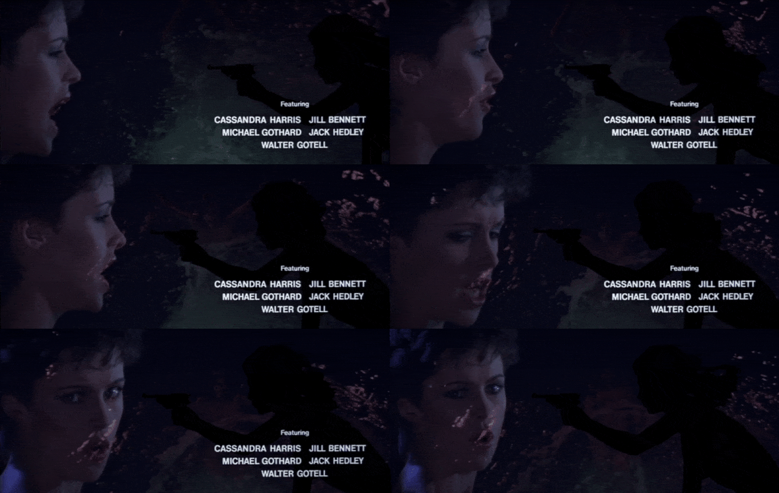
24. For Your Eyes Only (1981)
Main Tite designed by Maurice Binder
I have no proof that they play Sheena Easton’s “For Your Eyes Only” in hell, but who needs proof when you have ears? I’m only half kidding. But not really. For Your Eyes Only holds the unique distinction of being the only Bond title sequence to feature the theme song performer within the actual sequence itself. And there’s a reason it’s the only one. Much like the cold open (wherein Bond visits his wife’s grave and drops Blofeld down a chimney), the opening credits have fuck all to do with the film itself. And other than Binder’s infatuation with Easton’s striking face, conceptually it’s a bit confusing and music video-y. This sequence is in contempt of court for being the worst thing a Bond sequence can be: boring. (Meg Shields)
23. Spectre (2015)
Main Tite designed by Daniel Kleinman
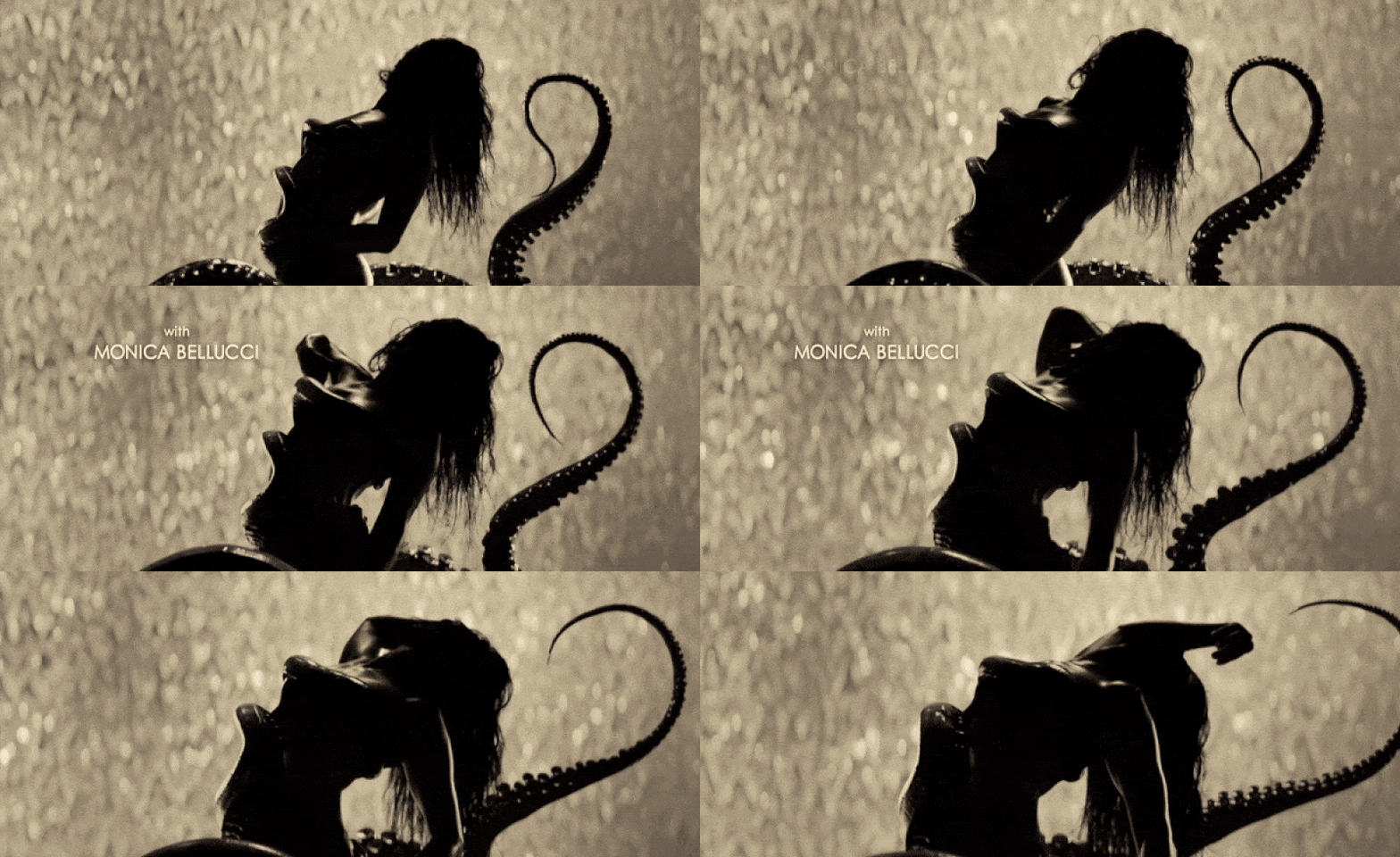
These titles upset me more than any poorly aged moment from the Connery films. For starters, there’s the forgettable song and the overly literal imagery that drags this down to unfortunate depths. But more than that, these titles also struggle with the central problem of Spectre: there’s no individual identity. We have images from the prior Craig films included as references to seemingly inform us that this film is about something, but what that something is or what makes it distinct or interesting? That’s unclear. One thing that is clear is that this franchise owes an apology to octopi everywhere. (Anna Swanson)
22. Moonraker (1979)
Main Tite designed by Maurice Binder
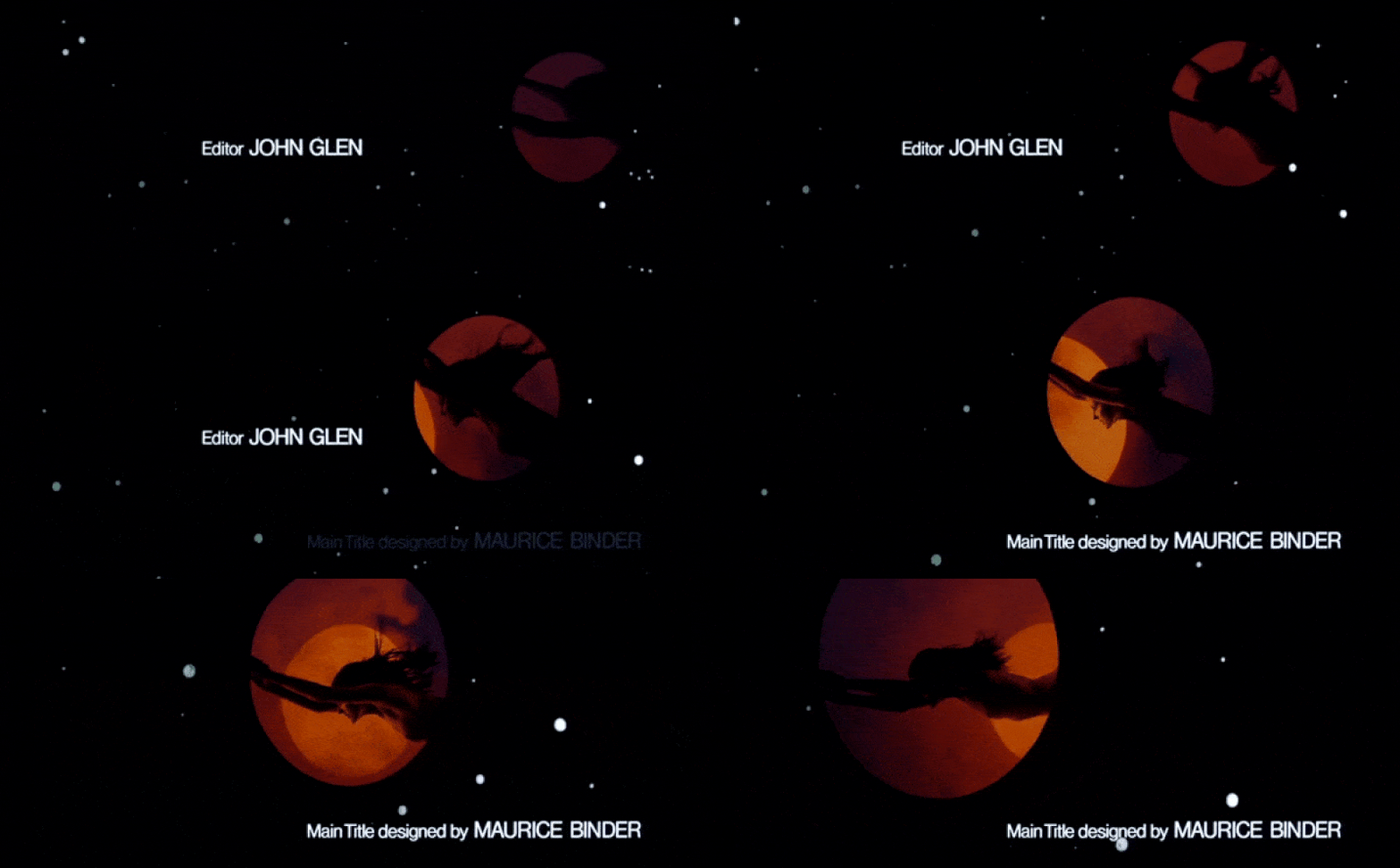
There isn’t a theme song that Shirley Bassey isn’t capable of nailing, and Moonraker gets points for the beauty of her voice and Binder’s choice to match its smokey cool quality with some hazy, cloudy imagery. There are some gorgeous aesthetics at play here. But the twirling and bouncing female silhouettes feel a little too much like a lite version of The Spy Who Loved Me. If it ain’t broke, it doesn’t necessarily have to be fixed, but this sequence proves that lightning doesn’t strike twice. What is stunningly captivating about one film’s titles can’t always be replicated and instead comes off as a little dull and derivative. For a film that exists because it can capitalize on its space theme, the opening titles are surprisingly lacking in space images. There are a few shots of the Moon and Earth, and one of a woman seemingly flying through the air, but when the entire galaxy was potentially at play, Moonraker is unfortunately weighed down by this sequence. (Anna Swanson)
21. Dr. No (1962)

Main Tite designed by Maurice Binder
Animation by Bond, Trevor Bond. (Sorry, I couldn’t help myself.)
Although James Bond’s first cinematic outing with Eon Productions has many virtues, its main appeal is as a kind of “fertile crescent” for the tropes, aesthetic, and vibe of the whole franchise. Fittingly, the film’s opening sequence contains the kernels of a prototypical Bond theme, but in true Dr. No fashion, it’s all…a little off. Dr. No’s title sequence is probably the least Bond-y of all the titles. The minimalist graphic design of dovetailing shapes and silhouettes are far more elusive and subtle than its bombastically abstract peers. Adding to the off-ness, Dr. No’s sequence features three entirely different pieces of music, among them Monty Norman’s famous “James Bond Theme” (Dr. No is only one of two title sequences to feature the theme in the sequence itself). However, undeniably, the basics of a Bond title sequence are there, from the colorful female forms to the now-iconic gun barrel opener, a fortuitous last-minute pitch by Binder. All told: this is a very modernist and intellectual sequence. It’s clean, to the point, but like the film itself, a little restrained and tentative. (Meg Shields)
20. You Only Live Twice (1967)
Main Tite designed by Maurice Binder
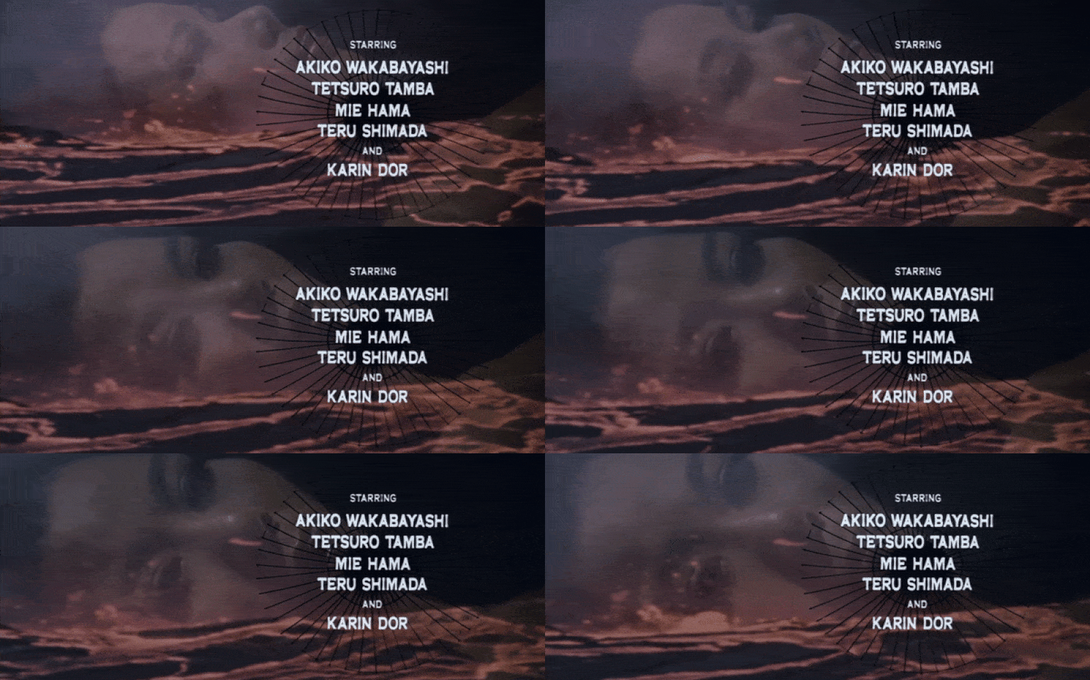
This credits sequence doesn’t reinvent the wheel, but maybe it doesn’t need to. You Only Live Twice pulls its aesthetic from the film’s elevator pitch: Japan and volcanoes. Fires are smoldering, lava is flowing, and women are both stereotyped and silhouetted. Problematic? Yes. On brand for Bond? Definitely. The title song from Nancy Sinatra is slow and melodic, and the credits sequence keeps the pace, which is to say this sequence takes a leisurely stroll through its imagery. If you don’t like it, it comes across as sluggish. If you’re on board, then it’s meditative. Either way, there’s nothing truly extraordinary happening here, but I admit that I fall into the camp of enjoying the volcanic explosions. Team meditative. (Anna Swanson)
19. Octopussy (1983)
Main Tite designed by Maurice Binder
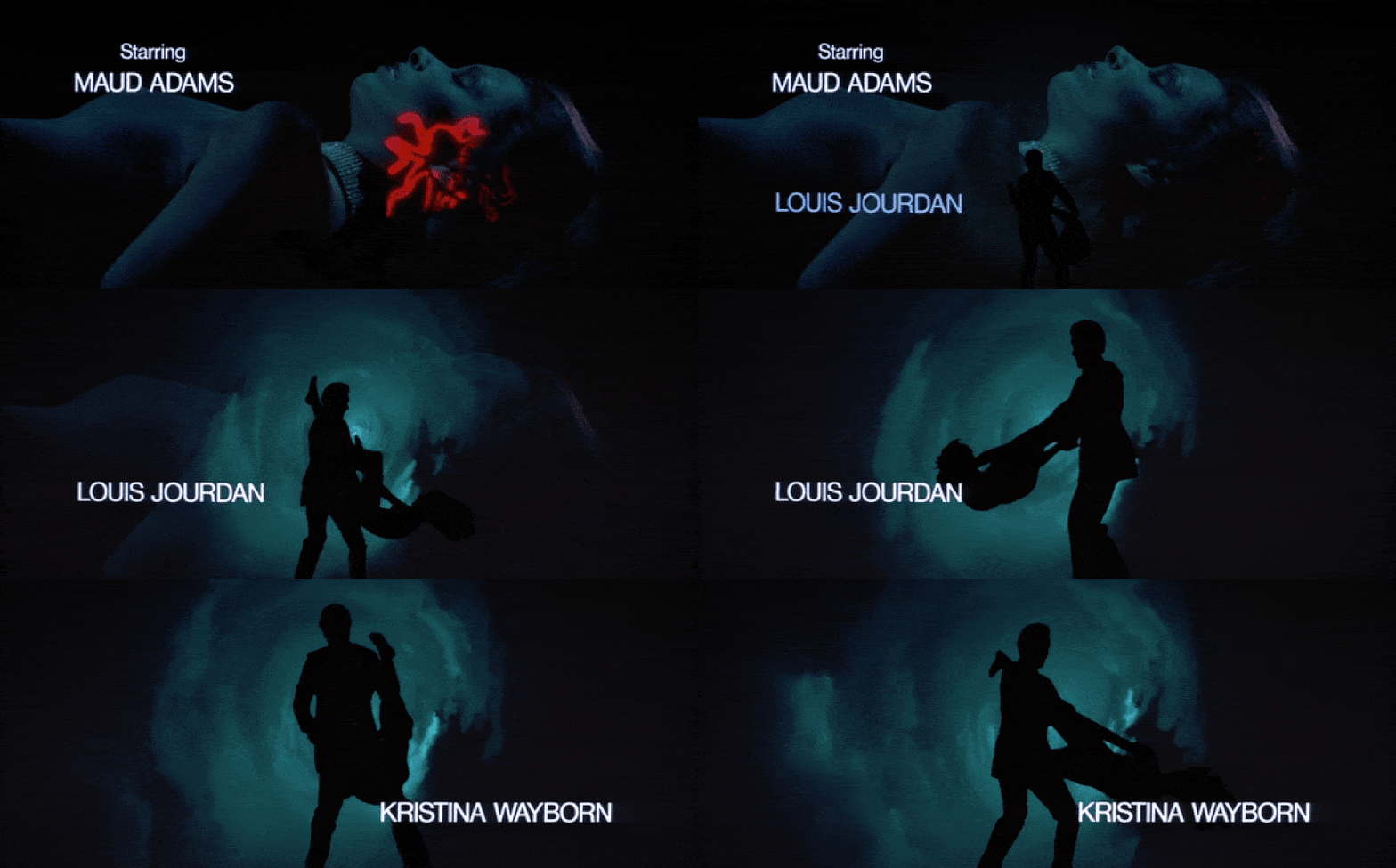
Octopussy’s title sequence is the “hey can I copy your homework” of Bond title sequences. Binder departs from his usual format and steals fan-favorite flourish from Robert Brownjohn. Namely: projecting images onto female bodies. Only Binder uses (hold your breath) lasers. Do lasers have any narrative relevance to Octopussy? Nope. Oh well, at least it looks cool. Oh, what’s that? It actually looks terrible? They hadn’t really cracked detailed laser-tech yet in 1983? There are a couple of moments when the cookie-cutter laser shapes cut through clouds of smoke, which creates some cool light-scattering for the tried-and-true silhouettes to somersault in front of. But here’s the thing: we have yet another sequence with very thin connective tissue to the film it introduces. Octopussy is the movie where Bond goes to the circus. Surely that’s a fertile conceptual playground that could lead to some compelling and relevant visuals? Instead, we got one of the safest Bond title sequences out there with a (Mike Myers voice) frickin’ laser. It’s fine. Rita Coolidge’s camp bop “All Time High” deserved better. (Meg Shields)
18. On Her Majesty’s Secret Service (1969)
Main Tite designed by Maurice Binder
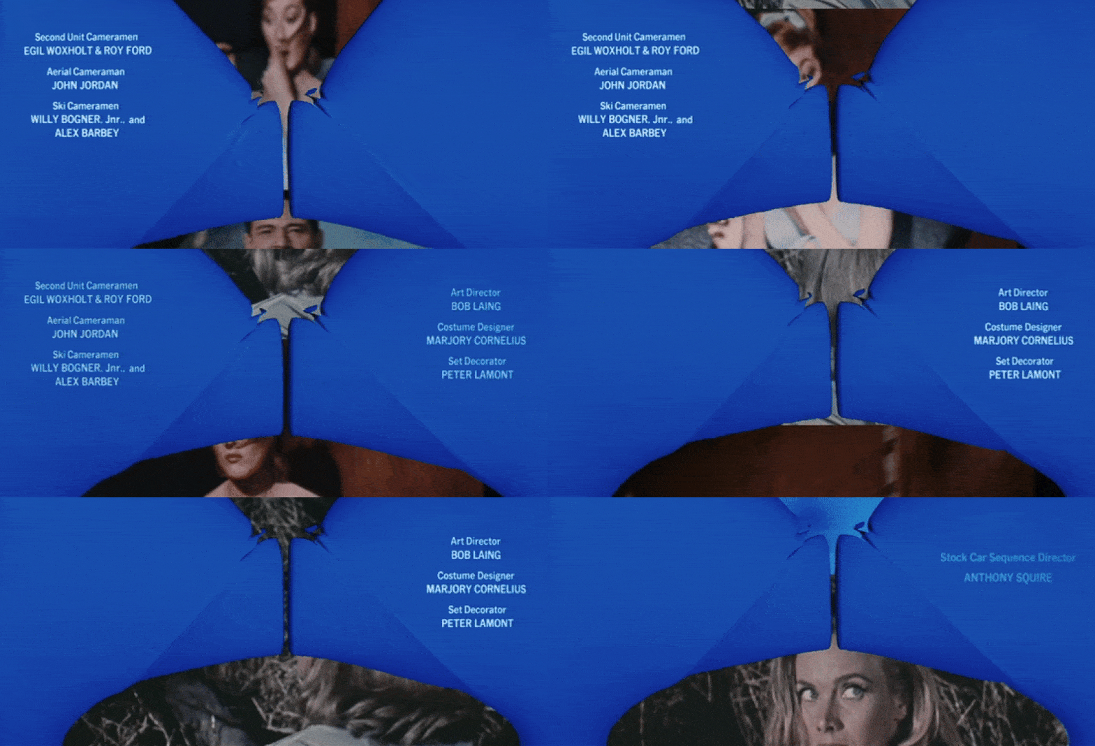
Like the movie itself, the title sequence for On Her Majesty’s Secret Service is a little weird and certainly polarizing. It falls in line with the first act’s need to remind everyone watching that, yes, this is a Bond movie… no, Connery is not in it… please don’t walk out and ask for a refund, we promise this is still James Bond, he’s just different. A highlight reel from the prior five films is displayed while the horns from John Barry’s score blast. It’s a touch idiosyncratic and the rest of the visuals are rather understated, allowing much of the heavy lifting to fall on the song itself. Thankfully, the ultimate saving grace is just how great the theme is. The score for this film is undeniably magnificent and this opener is a rip-roaring instrumental thrill, and the song carries the somewhat uninventive aesthetics as well as anything could. (Anna Swanson)
17. Thunderball (1965)

Main Tite designed by Maurice Binder
You gotta respect honesty in advertising. Thunderball is the wettest Bond film, so it only makes sense that its opening title sequence would be equally aquatic. Thunderball’s credits take place in a sub-nautical disco; an effervescent, technicolor acid trip with groovily warped text to match. Should you think too hard about all the men pointing harpoons at the silhouetted bathing beauties? Nah. What does “strikes like Thunderball” mean? It doesn’t matter. It’s a transfixing sequence; in small part, one suspects, because the premise for its visuals actually makes a bit of sense. Figures swim across the screen through jets of color-shifting bubbles and wayward currents; they dive, flip, and tread, and it’s a sight to behold. Also, look. Tom Jones is a lot. But Bond films are a lot. In this era, he’s up against the diva Shirley Bassey, and he holds his own. Man damn near fainted after that nine-second final high belt: respect! (Meg Shields)
16. Tomorrow Never Dies (1997)
Main Tite designed by Daniel Kleinman
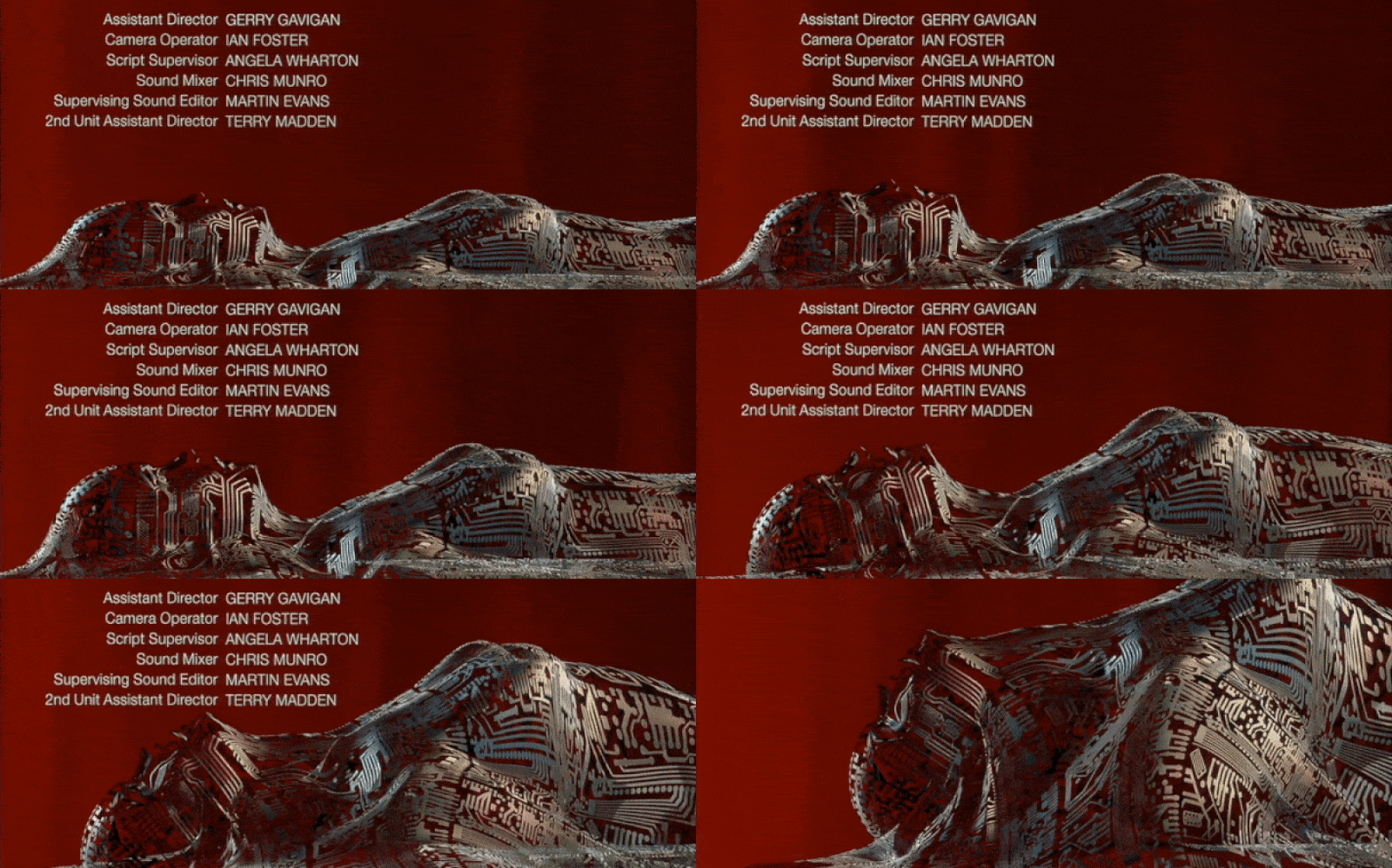
These cyber-inspired opening titles are a little weird, but they certainly gel with the central tech-focused premise of the film. Sheryl Crow’s song has more of a classic feel that could have clashed with the visuals, but instead, it conveys a melding of sensibilities: the history of Bond and the modern world he finds himself in. It’s also got the classic images of girls and guns, but with some x-ray-centric and cyber twists. It’s the old and the new meeting one another. It’s a little odd, but it works. (Anna Swanson)
15. The Living Daylights (1987)
Main Tite designed by Maurice Binder
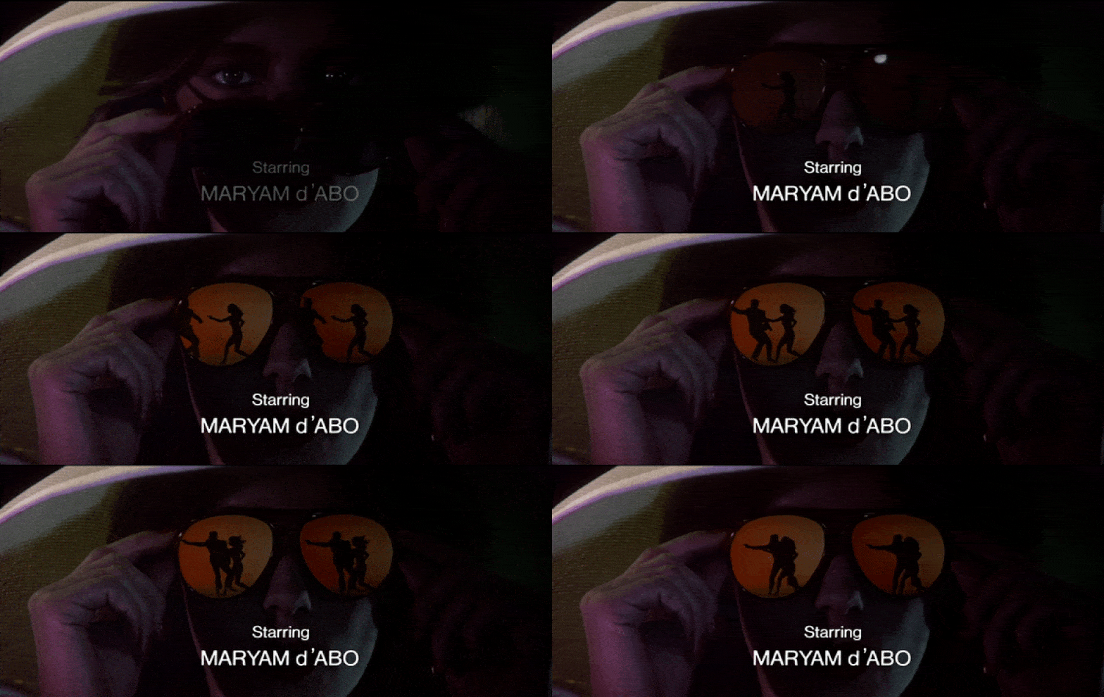
A perfectly respectable sequence that reads like someone skimming a James Bond Wikipedia entry, The Living Daylights’ sequence has guns, girls, cars, gadgets, and hooch. Binder’s back at it again with the water distortions and the mattes. It’s enjoyable, familiar, and far less bombastic than Binder’s previous work on A View to a Kill. The pivot in the palette from neon to intersecting primaries is emblematic of the Bond reset this film represents: a new Bond may have taken up tenure, but this is still Bond. Nothing to worry about. A-ha comes out swinging with a rather pop-y theme, more of its time than timeless, but enjoyable nonetheless. (Meg Shields)
14. The World Is Not Enough (1999)
Main Tite designed by Daniel Kleinman
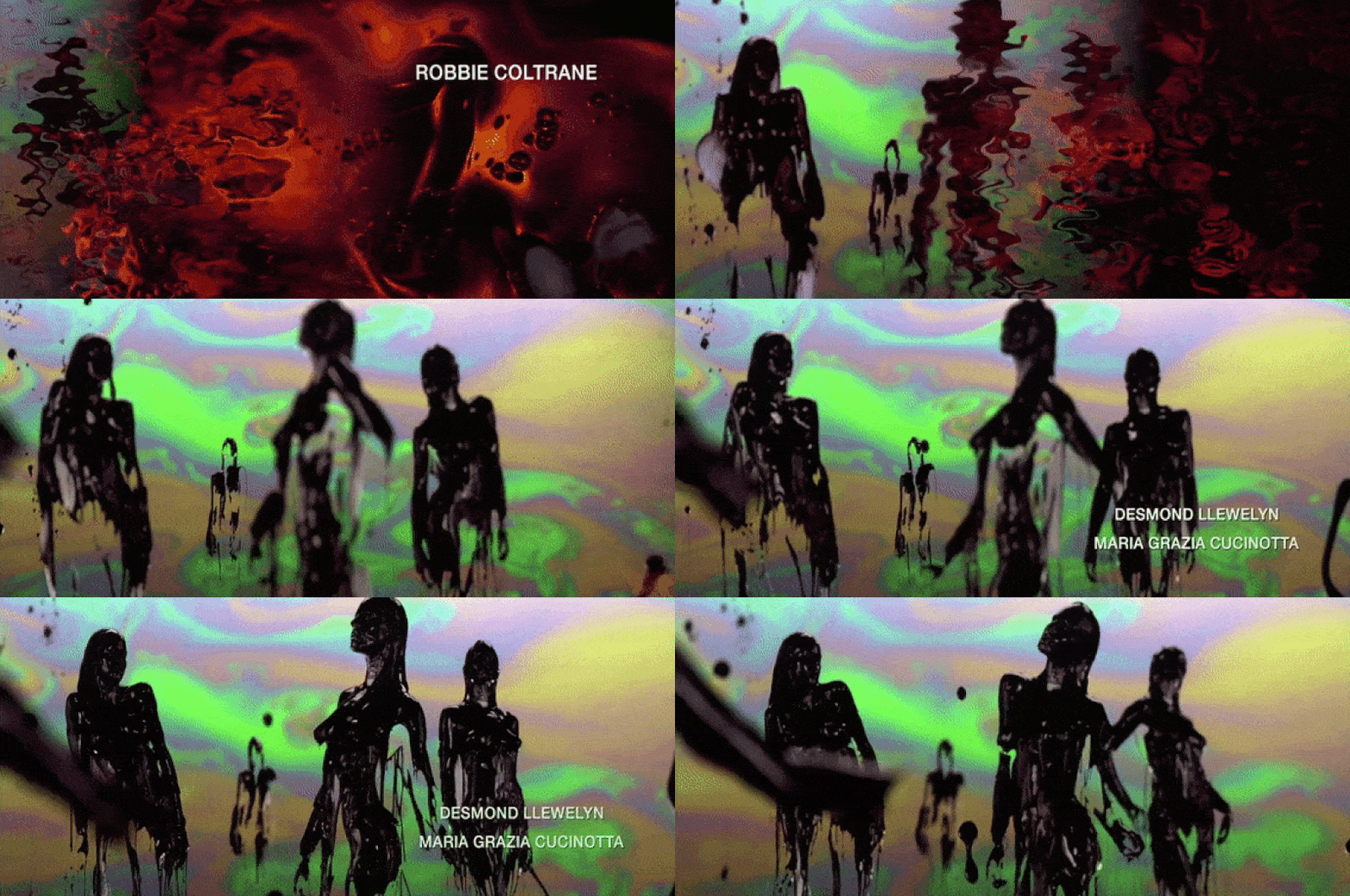
With rainbow oil spills, thrusting rigs, and women covered in nothing but tar, this is certainly one of the more thematically aggressive Bond title sequences. We’re still ankle-deep in slippery ’90s CGI. But if you look past the rubbery sheen — and the occasional frame over-crowded with…lighting reference balls? — there’s a lot to be admired. Like Garbage’s theme song, a slinky belter that matches the textured, viscous visuals of the title sequence. The throwback to the Moore-era cold open transition into the title sequence is also a treat. The world may not be enough, but as far as the Brosnan title sequences are concerned, this’ll do just fine. (Meg Shields)
13. The Man with the Golden Gun (1974)
Main Tite designed by Maurice Binder
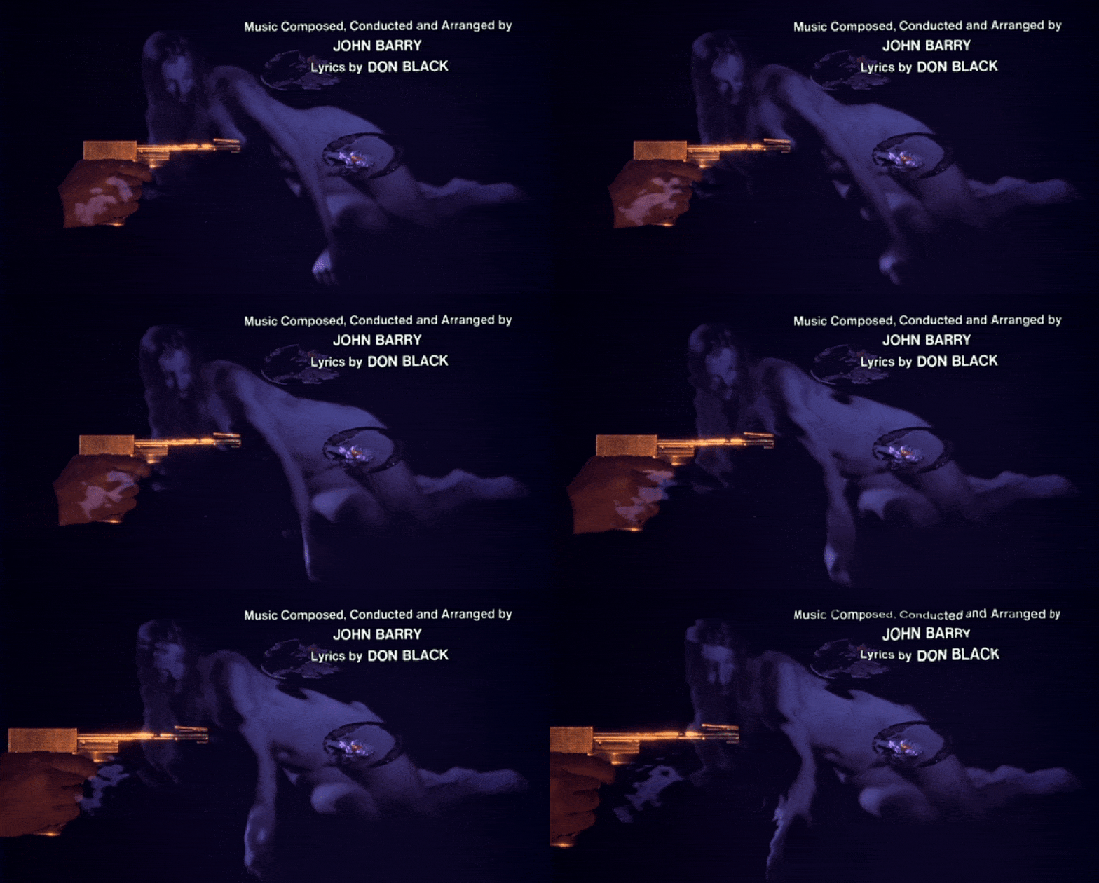
The beauty of this title sequence is that just when you think the reflective water imagery is all you’re gonna get and the pop tone has mellowed out, it gets sparkly and bright, showcasing a woman gyrating against what can only be described as a glitter fire. Before this explosion, the aesthetic is ripples on water, recalling the distortion of the credits in From Russia With Love, and needless to say, this counts as a win. And of course, because Binder knows what we want to see, there’s plenty of shots of the titular golden gun. They set it up, he knocked it down. (Anna Swanson)
12. Die Another Day (2002)
Main Tite designed by Daniel Kleinman
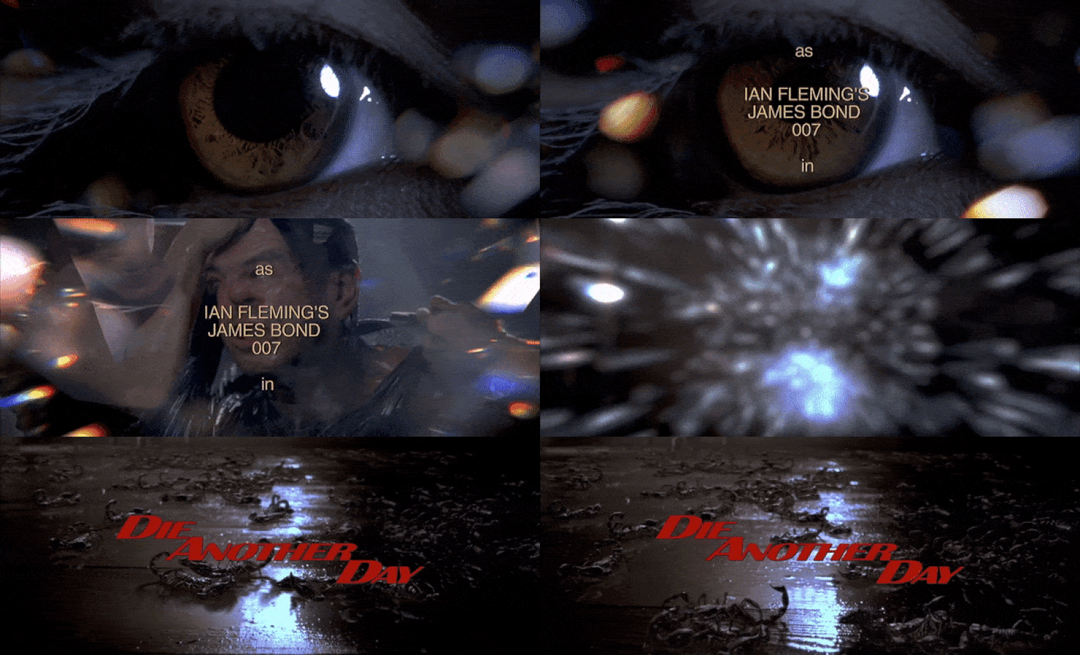
No matter the faults you might find elsewhere in Die Another Day, these opening titles are strong as hell. It captures the fracturing mentality of Bond as he’s tortured with fire, ice, and, yes, literal scorpions. It’s gnarly and hypnotic. The dancing silhouettes incorporate some classic Bond images, but these titles also feel new and innovative in their startling representation of literal plot elements. And as far as the song goes, you don’t have to love Madonna’s theme, but it’s clear she did come here to shake up the system. Mission accomplished. (Anna Swanson)
11. Casino Royale (2006)
Main Tite designed by Daniel Kleinman
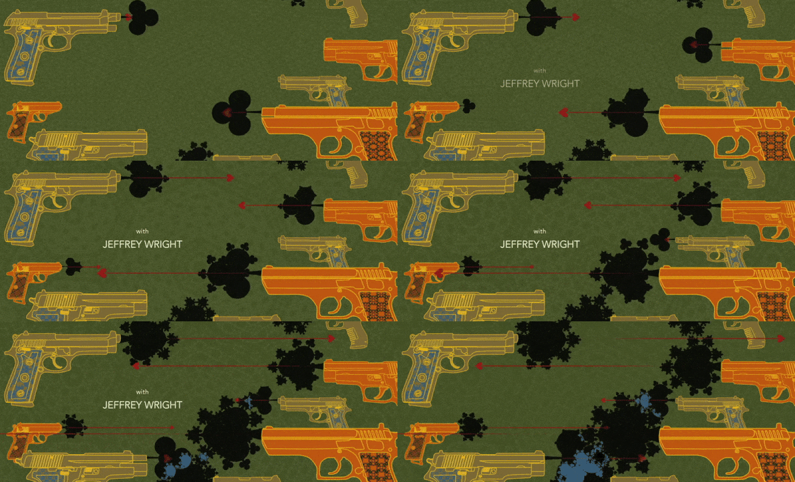
There are many shake-ups in the Bond franchise. And among those shake-ups, Casino Royale ranks pretty damn high. After all, what better way to (yet again) reinvent 007 than by going back to his origins? This is a title sequence for a Bond that is, in many ways, not quite Bond yet. And Kleinman distills this tentative new intent into a clear graphic language, where gambling and murder are risks equally worth taking in Bond’s trajectory towards legend status. The sequence is flat but its gait is dynamic, coming out hot with a modernized gun barrel that sees Bond firing at an actual attacker. It’s clear, geometric, and it epitomizes the overarching goal of Kleinman’s tenure: to challenge long-standing Bond motifs while still honoring their original intent. The Soundgarden is nice too. (Meg Shields)

0 comments:
Post a Comment