In our Color Code column, Luke Hicks chooses a handful of shots from a favorite film in order to draw out the meaning behind certain colors and how they play into both the scene and the film as a whole. For his fifth entry, he digs into Todd Haynes’ Carol.
Todd Haynes introduces us to the subdued yet dazzling color palette of his sixth feature in the opening credits. Bold, blocky typeface appears in white over a black background. The credit dissolves, and another appears, this time in grey. The grey adopts a touch of green in the next credit, then fades from olive into aqua before the first image appears: a close bird’s-eye-view of a wiry-patterned iron grate with the abyssal darkness of the subway ventilation shaft behind it. Cate Blanchett and Rooney Mara’s names appear in succession in a rich Tiffany blue as the camera slowly zooms out, the grating acting like wallpaper behind them. Carter Burwell’s ethereal piano score swells, and the translucent blizzard blue title card suddenly fills the screen — Carol — the grating now like bones in the letters.
The film’s credits change shade four more times, from cornflower to lavender, before the lens tilts up, revealing a nighttime New York City sidewalk buzzing with people. Loosely tracking a man, the camera floats through the street as the credits evolve across pale shades of purple, pink, orange, and yellow and back into cooler territory. The darkness of the street presages the moodiness of the cinematography, and the shadowy greys and tans point to the prominence of dark neutrals as a canvas for mixed palettes to pop, like we see in the glistening blend of warm and cool colors in the night – the golden effervescent glow of car lights, their silvery lilac reflection in the road, faded red neon hanging over the left side of the street, and blown out turquoise dangling like stars over the right.
The colors of Carol harken back to the colors of Ektachrome photojournalism in the early 1950s (e.g. Ruth Orkin, Esther Bubley, Helen Levitt). As cinematographer and longtime Haynes collaborator Ed Lachman describes, “It’s more soiled, muted – and it’s naturalistic, not an expressionistic look at the world,” like Far From Heaven, their other queer ‘50s-set drama. Where the color and tone of that film was crafted to reflect the oppressive artifice of the American Dream through the technicolor beauty of Douglas Sirk, Carol is fashioned to “incorporate the subjectivity of the amorous mind,” says Lachman. What does the world look like to someone falling in love for the first time? What does it feel like? How can color communicate the storm of emotion inside Therese Belivet?
That emotion is as complex – galvanizing, sickening, fearful, magical – as the subject of lesbian romance (and self-discovery) in 1952 suggests. And that complexity is mirrored in Haynes and Lachman’s approach, which hinges on imagery to accentuate queer alienation, much of the dialogue from Patricia Highsmith’s source novel, The Price of Salt, removed in Phyllis Nagy’s adaptation. In the silence and stillness, they use color, like body language and windows, to “convey what’s hidden on the surface,” which is paramount for a story set at a time when lesbians couldn’t speak plainly about their longing.

Haynes uses mixed color temperatures, on marvelous display here, to tell a story about mixed feelings. Warm colors, like peach and candy apple red, pop on the cool palette created by the heavy blue-green filter. Other warms, like mustard and magenta, are complicated by the filter, the former blending in with the cools and the latter blending more with the dark neutrals of the coats. According to Lachman, “early color film didn’t have the full-color spectrum.” The Ektachrome look they were going for had more pronounced hues of blue, green, yellow. But that doesn’t flatten the cool palette. The same dynamism of color exists, navy and forest green gravitating toward neutrals while pistachio floods the image.
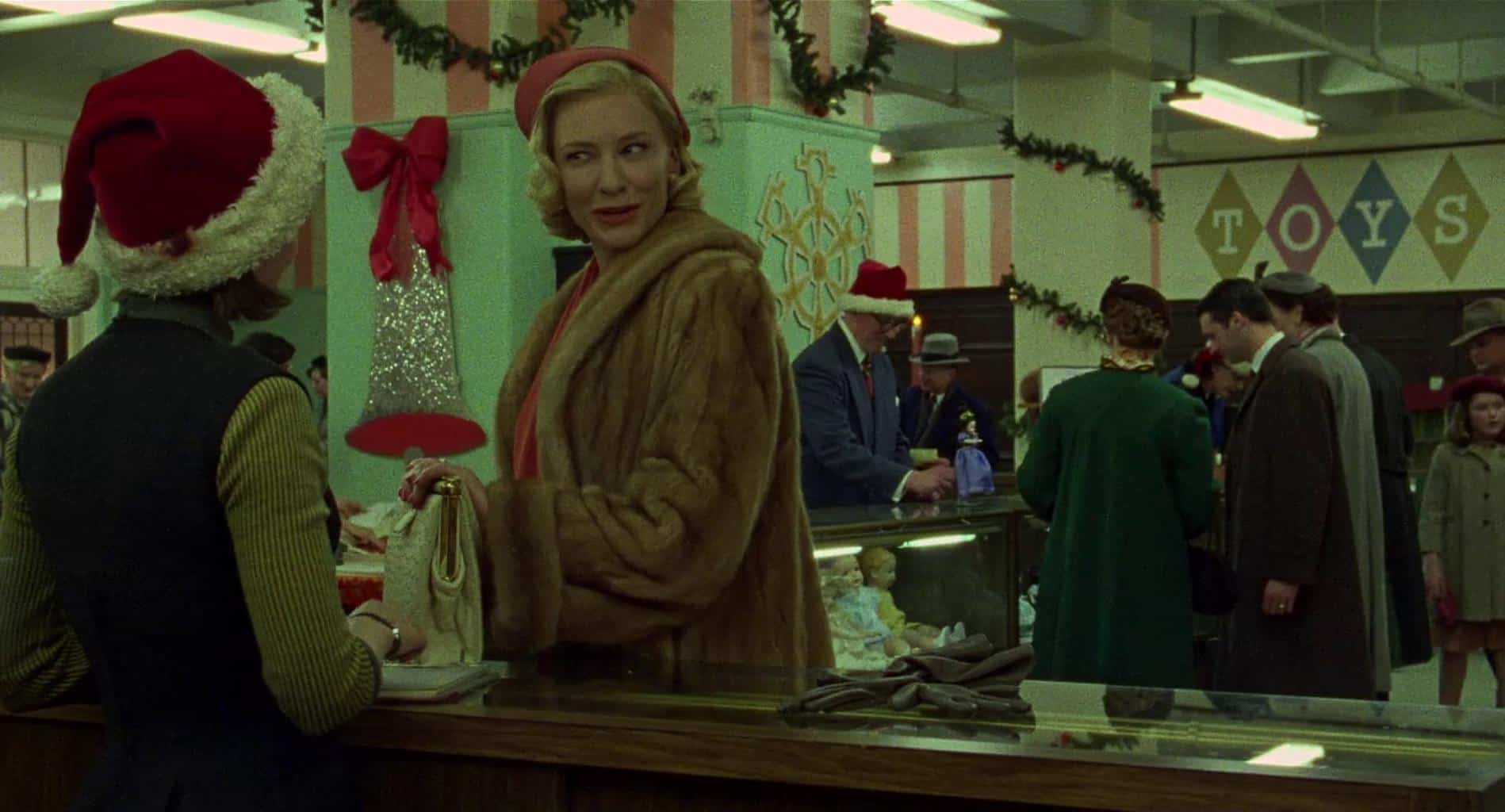
The pistachio shade of green on the wall is a staple of the time, deliberately placed behind Carol here to elicit her cool vitality, self-reliance, and tact – one made with equal parts reckless abandon (“Tell me you know what you’re doing.” – “I never did.”) and prudence. Green also represents growth and nurturing, which is perhaps why it’s so prominent in the image between the wall, the coat, and the overlaid filter. As Lachman said, the mood of the palette is meant to represent Therese’s emotion, and Carol is a nurturing presence for her, a benchmark of growth, a life-changing encounter. This is one of the kinder shades of green Lachman filters images through, seen best on its own at the edge of the overhanging lights warming the palette. Later, he uses garish green filters to convey anxiety and unwelcome heteroromantic advances. But here, in their first encounter, the saturation is dreamy – love at first sight.
That spark is seen in the near electricity of the glinting silver bell between them, which is topped in a brighter shade of red than our leads – red being the color of passion and love – each wearing a dominant neutral over a color presented elsewhere in the image. Carol’s rich rose hat, top, and lipstick, akin to the pale pink and magenta on the walls, exude an elegance paramount to Carol’s allure and drawn out even more by the sensuous fur coat, whose light color, loud style, and loose fit flaunts Carol’s comfortability with herself and her gayness. Seeing as it would’ve been a normal coat for a straight high society New York woman to wear at the time, it only says as much about Carol in relation to Therese’s tight, pitch-black sweater vest.
In color terms, black is the absence of light, a non-color. Therese often wears black, or darker colors, a visualization of her repressed sexuality that stands in sharp contrast to the consistent reds of Carol’s wardrobe. Here, the black is complimented by the queasy yellow-green of her sweater, which reflects an eagerness and uneasiness toward her queer desires. She wears the same sweater on their road trip, but, having shed some uncertainty, she sheds the vest, a more open, colorful version of herself.
Lastly, the shot sets the stage for the precedence of the complementary red-green color scheme. Red and green work together in countless shades in shots throughout the film, spotlighting the thematic significance of love, pain, and maturation and bolstering the infectious Christmas mood, which is felt in the sparkle of the grain even when the colors are absent. It’s like “looking at a photograph from the past,” as Lachman intended.

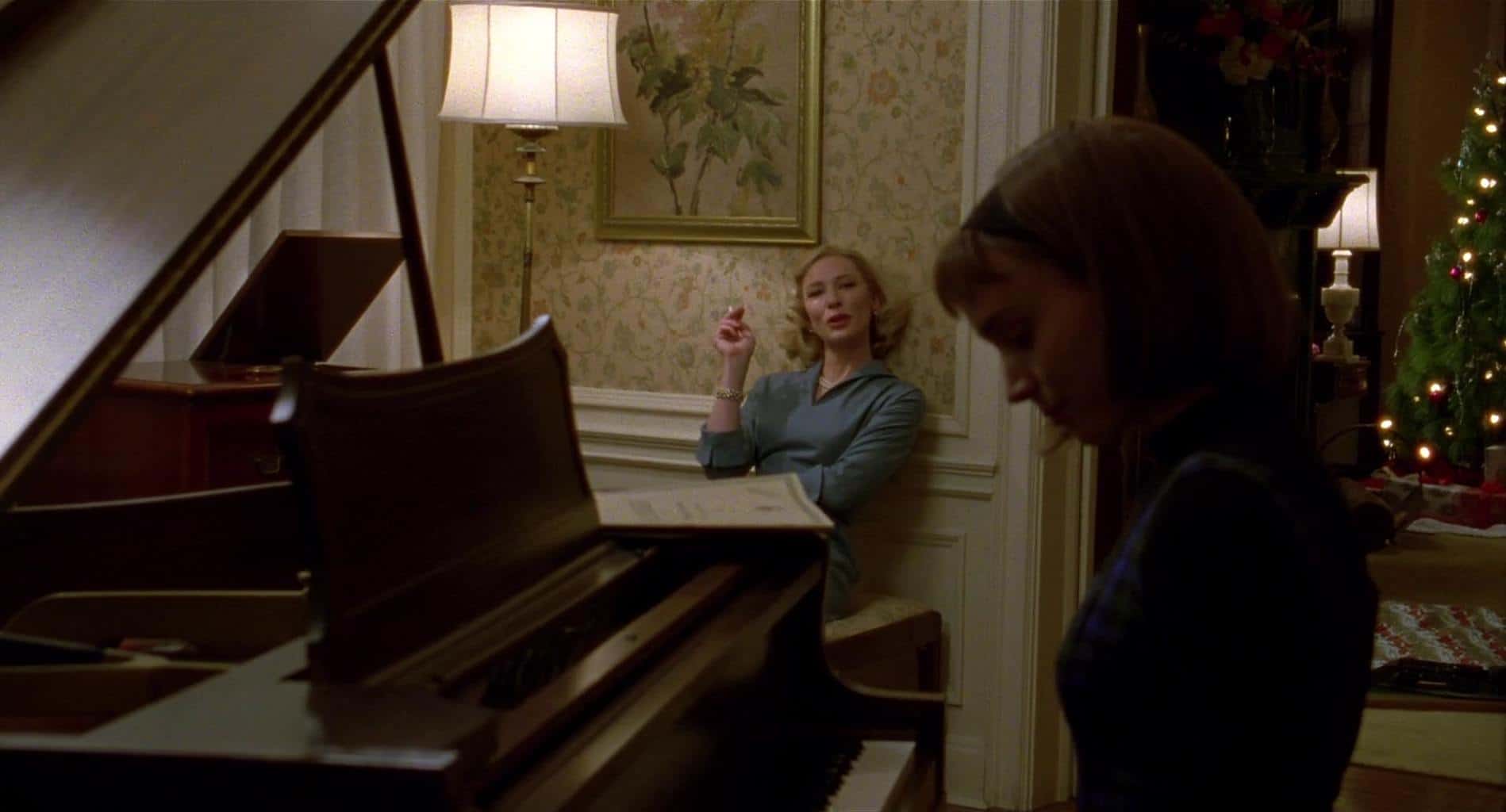
As is usually the case, there’s a stately sheen to Carol and her things and a dimmer, quieter, concealed look to Therese, reminiscent of the previous shot. However, this one exemplifies how the filmmakers use lighting to heighten contrast in color and tone between the two. The polished, dark oak piano fills a third of the screen, and Therese, in shadow, fills another, creating a warm, sultry V cutout in which Carol lounges. She’s having Therese over for the first time, and she’s in her element – chatty and loose, bathing in the glow of the lamp while smoking a cigarette.
Therese is still primarily wearing black. Her dress has an emerald-sapphire plaid pattern – subtly matched by a pair of Carol’s pajamas in a later sequence – which, in its royal cool tones, signifies an alignment with Carol (in Carolina blue) and a minor blossoming for Therese in showing up to her home in the first place. But the dark lighting and compressed, inward body language reveal that she’s still in hiding, just as Carol’s shine and open, relaxed stance reveal her outness. She is, at least, as out as a suburban elite mother could be in the ‘50s without being ostracized, which would mean the loss of a child for Carol.
The golden frame, lamp stem, flowers, and jewelry underscore Carol’s radiance and highlight her blonde locks, much like the piano points to Therese’s dark natural brunette look, hair color being the most consistent thematic juxtaposition between them. The faint floral green and pink of the beige wallpaper sit delicately behind her, accentuating her charm and her role in Therese’s life as a garden in which to grow into her own. And the red-green of the wrapping paper and Christmas tree give it a holiday feel without clashing with the prominence of the analogous blue-green-yellow color scheme.
“When things are getting better in their relationship, the colors become gentler and more beautiful with more warmth,” said John Dowdell, the film’s colorist, who’s worked with Haynes numerous times, almost as much as he’s worked with Jim Jarmusch. We see that gentleness and warmth on full display here in their first moment of true privacy. But it’s worth noting the darkness of the image, too. In general, the cinematography of Carol is surprisingly dark, but the Super 16’s vast depth of field and ever-shimmering grain keep the darks from getting crushed (hence, why we can make out the blue-green in Therese’s dress) and give the film a crystalline quality as irresistible as Carol herself.

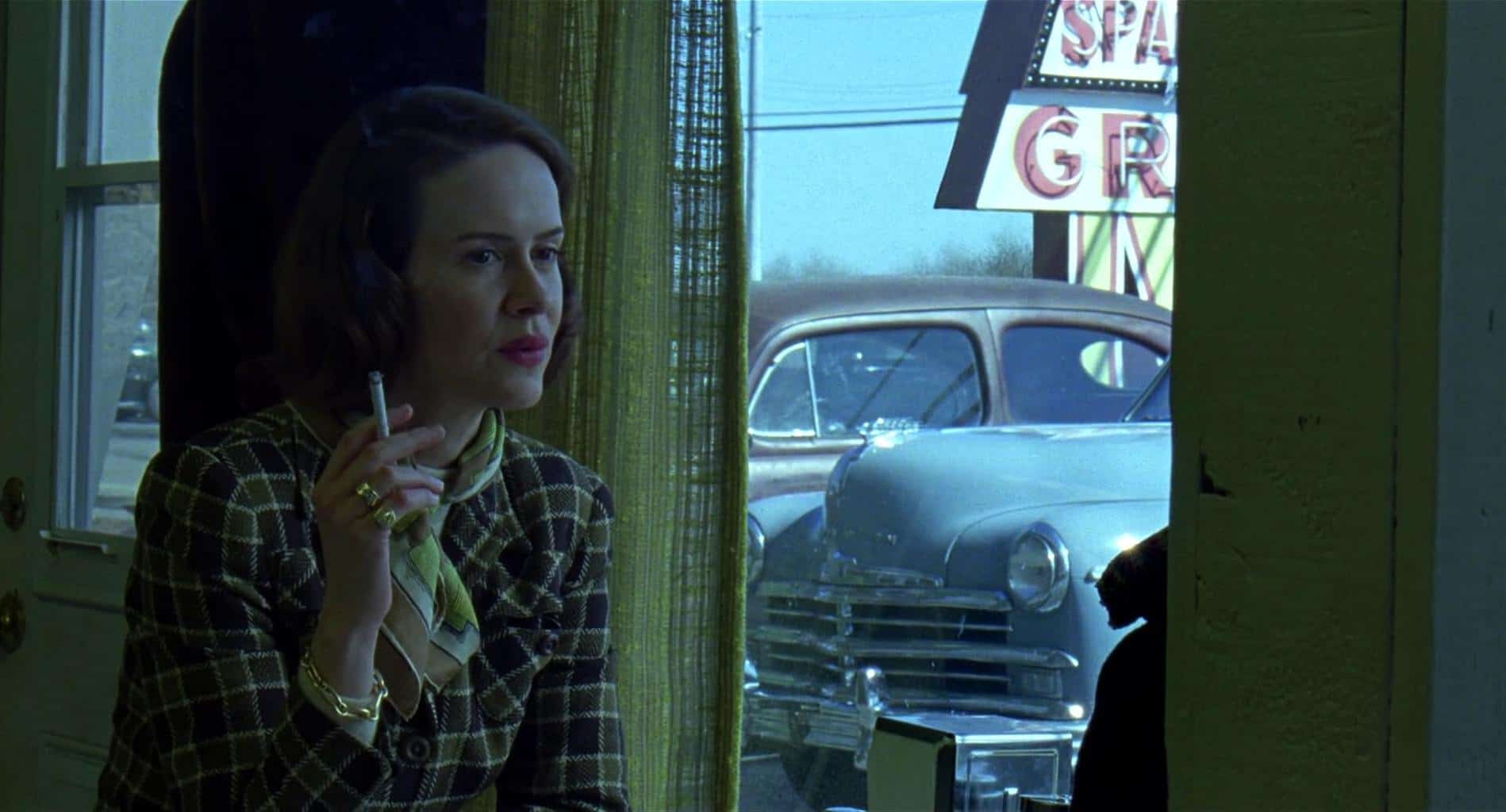
Yellow is a secondary color throughout Carol – an ally for red or green, much like Abby Gerhard (Sarah Paulson) to Carol and Therese, although “aide” might be a better descriptor. Carol’s childhood best friend and ex-lover gives new meaning to the phrase “lean on me.” After Carol leaves Therese in the night, Abby appears the next morning in the corner of the room like a guardian angel to take Therese home upon Carol’s request. Therese wakes up confused but immediately realizes what’s going on. Puffy-eyed and miserable, she sits across from Abby in this shot inside a diner on a pit stop on their road trip home.
The use of yellow and neutrals on and around Abby indicates her position in the relationship: a neutral party. However, brown, grey, or black could’ve communicated that well enough. The heavy addition of dandelion and lemon hues expresses warmth in her neutrality. She’s a neutral party in the relationship, but she’s not neutral towards them. On the contrary, she’s a light for the couple, a hope, as yellow suggests – an eternal outlet for Carol and, in her age, a beacon of sage wisdom for a mourning Therese (“It changes. Nobody’s fault.”). Like a lighthouse, her presence keeps the two from crashing into the rocks, be those the rocks of a lost daughter or suffocated sexuality.
Abby isn’t mad at Carol for calling in a titan favor. She doesn’t “hate” or resent Therese for stealing Carol, as Therese suspects. “You really think I’ve flown halfway across the country to drive you back East because I hate you and want to see you suffer?” she asks in a caring, concerned tone, subtly reminding Therese that she is her (yellow) taxi. Even the location of the color is deliberate. Notice how her backdrop is the same color as her outfit, and how the gauzy drapes split the screen in half, separating Abby from the other colors. It’s no coincidence that red, green, and blue adorn Therese’s side of the screen just like it’s no accident that the fresh chrome of the bumper sits on Therese’s side, contrasted with the gold (we associate with Carol) in Abby’s jewelry.
Between the golds, yellows, and browns, Abby seems monochromatic, but the prominence of the sky-blue filter over everything, met by the car and sky itself, create a complementary yellow-blue scheme. Sky blue often represents loyalty and trustworthiness, as it does here in Abby, but it also represents gloom, which is why the image is filtered through it – a saturation of Therese’s emotion. That’s also why it’s stuck to Therese’s side of the screen.

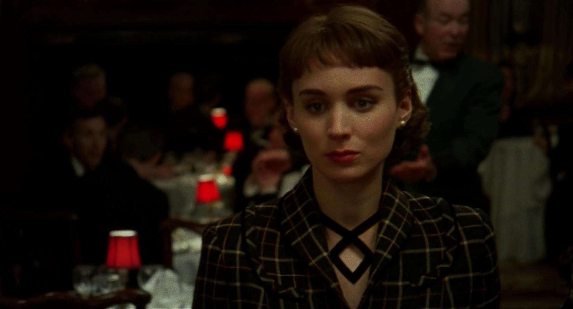
A Rembrandtian portrait of Therese in the seminal embrace of her queerness, this shot takes place moments before the final shot and is the last image we see of her. She’s just bailed on a party to find Carol after an ambiguous, interrupted conversation earlier in the night in which Carol confessed her love and Therese remained silent. Now, we see her walking toward Carol in a dimly lit restaurant. There is a haunting dominion of men behind her, who, in their hazy shadow, reminds us that, in looking for Carol, Therese is braving the dark of both her sexuality and the repudiation of hetero-masculine values of the time.
The chiaroscuro lighting of the image and the proliferation of neutral tones bring out the red in the little lampshades, which exude intensity and passion. Like Therese, they are a singular presence in the room. They lead her to Carol (who is represented by red throughout) like rose petals lead to a lover or runway lights guide a pilot to land. To achieve even greater emotional realism, the camera becomes handheld for the first time in the film, trembling in rhythm with Therese. The film grain adds another visible layer of subtext that reflects her emotional state.
Much of the time, Therese seems shy. But she’s not. She’s understated and disoriented (“I don’t even know what I want to order for lunch”), but that doesn’t imply a lack of confidence. She’s very self-assured, and we see that here in its most breathtaking form. “Only does the point of view, the subjectivity of the amorous mind, change at the end of the film,” explains Lachman. After spending the duration obscured by the frame (partially visible, pushed to the sides and corners), Therese is centered, the only one in focus, a clear, total vision of her queer self. As she puts it: “I’m wide awake. I’ve never been more awake in my life.”
0 comments:
Post a Comment